

.svg)


Coming up with a company logo - whether you're rebranding or starting from scratch - that engages your desired market, looks great and represents your brand values can be a challenging feat. In this article, I’ll take you through exactly how to do this step by step.
Before we dive into the creative process, let’s take a step back and look into the different things you ought to have in place that can support a great logo.
Step One — Know Your Users
A good way to start is to create some user personas. User personas are fictional personas of your ideal customers and are a representation of your target audience. They can be hugely helpful when designing a logo as you can step inside the shoes of your users and think will this design/ feature appeal to this persona. It’s important to be empathetic to the expectations and desires of your users so that you create designs that are truly user-centered (or human-centered as I like to say). You may have some personas already but if you don’t, try and think of a few different people who would represent your audience or desired audience. If your intended market is unfamiliar to you, conducting interviews within this type group is a beneficial way to create more accurate personas. If you already have data available this is a great place to start. The more specific you go with this, the more effective the Persona.

Step Two — Know your position in the market
Knowing exactly how you want to position yourself in the market is key to designing a great logo. Are you exclusive and premium or more friendly and open? Are you a tech innovator or an eco-warrior? Nailing exactly what you stand for guides your design process. When you know this you can create a logo that attracts the right kind of people.


Step Three — Research & Brainstorming
Another important step is research — researching your industry and your competitors is an important task if you want to create something that stands out amongst the noise. The goal here is to get an idea of the current landscape in your industry — what are the trends and themes — what’s working, what’s not. Taking note of this and applying this to your current logo may help you utilise what is already performing and kick start the design process.
From here, comes the brainstorming and ideation phase. Start by creating mind maps and looking for keywords that can serve as a starter for developing logo design concepts. I usually start with the brand values and keep extrapolating until I find three keywords that are inspiring and reflect the values — the more descriptive the better. Once I’ve decided on my three keywords I would then create some mood boards around them to help keep my sketching focused.

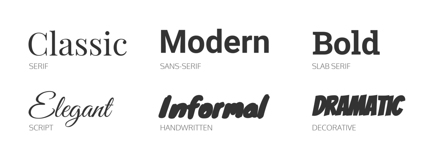
At this point, it’s also important to consider typography if you think your logo will need to include type. Font choice is important and can really evoke your brand values. Serif fonts (with the little feet) tend to feel more traditional and established whereas serifs are more modern.


Step Four -Sketching with Depth
From your mood boards and research, you can now start the sketching process. It’s best to start sketching on paper (or with an iPad and Apple pencil if you’re feeling fancy). Use your mood boards and keywords to keep your work focused and inspired and keep in mind your personas. Sketch as many different ideas as you can. If you’re feeling uncreative, take a break. Playing ping pong, meditating or going for a walk can be all you need to have an ‘ah hah’ moment. Once you feel like you’ve exhausted all avenues, take some of the directions you think are working best and get some feedback from your colleagues/friends — whoever is willing to cast an eye over your designs. It’s good to get an objective perspective on your work.

Step Five — Execution
Once you’ve determined a few directions to explore its time to get your sketches into the computer. We like to use Adobe Illustrator, this is the industry standard but the downside is that it’s a subscription-based model and can be pretty expensive. There are other cheaper and free alternatives if you have a google around (Figma, Sketch and Affinity Designer come to mind). The important thing to remember is that you need to be designing in some kind of vector-based software. This enables you to create a logo that is infinitely scalable as opposed to say, raster-based which will become pixelated once scaled up.


Another important thing to remember is scalability. Your logo will need to be able to look good on a range of sizes, from small favicons, right up to large scale print. It’s good to create a few different formats for your logo and a monochromatic version if your logo has colour.

Another thing to help guide the execution of your logo is to think of the below five principles to effective logo design. Is your logo appropriate — does it cater to your target audience? Is it memorable — often the best logos have a story behind them or are in some way ambiguous and intriguing. The longer you can get people to look at your logo the more memorable it will become. Is your logo timeless — it isn’t just following the latest design trends but has depth? Simplicity is also key for logos — it’s important for your logo to not get too convoluted. Avoid overly decorative logos with too many colours, flourishes or shadows as an overly complex logo is more difficult to remember. Finally, your logo should be versatile — it should look good in black and white and on a variety of formats and scales. It’s also good here to think of extensibility — what could the logo look like if it was animated or 3d? How far can it be pushed?


Step Six — Testing
Once you’ve created your logo directions in digital, it’s good to get further feedback and if possible, do some testing with real customers or people who fit your persona types. By doing this, you’ll be able to gain an understanding of whether or not your direction is something that is resonating with people and whether it is accurately representing your brand values. When conducting interviews for this kind of research make sure you avoid asking leading questions as this could lead to inaccuracies in your data. An example of a leading question is something like — ‘Does this logo give you a feeling of trust in the product?’ as it's adding a positive spin to the question making people feel more obliged to say ‘yes’. A better question would be something like — ‘How does this logo make you feel?’.
Step Seven — Final Iterations and Mockups
After receiving feedback you’ll need to do any necessary refinement and then you will be all set. At this point, it can be helpful to do some in situ mockups to bring your logo alive and close the creative gap for your intended audience.


So there you have it — a brief overview of the logo design process and how you can use it to create a logo with depth. The key thing to remember is the importance of strategy in the design process. Strategy enables you to create a logo with intent which better represents your brand values and serves your users better. Human-centred design also gives you a framework to create something that resonates with your users rather than just creating something that simply looks pretty.
Any questions feel free to reach out to me. Thank you for reading.

