.svg)


The challenge: To create an identity for a new creative co-working space that feels inspired with a sense of community that can then be extended to other cities.
The solution: Created a brand identity that was inspired by Brutalism to give the community the autonomy to shape the creative space themselves so that each co-work would have its own distinctive feel based upon the evolving community within.
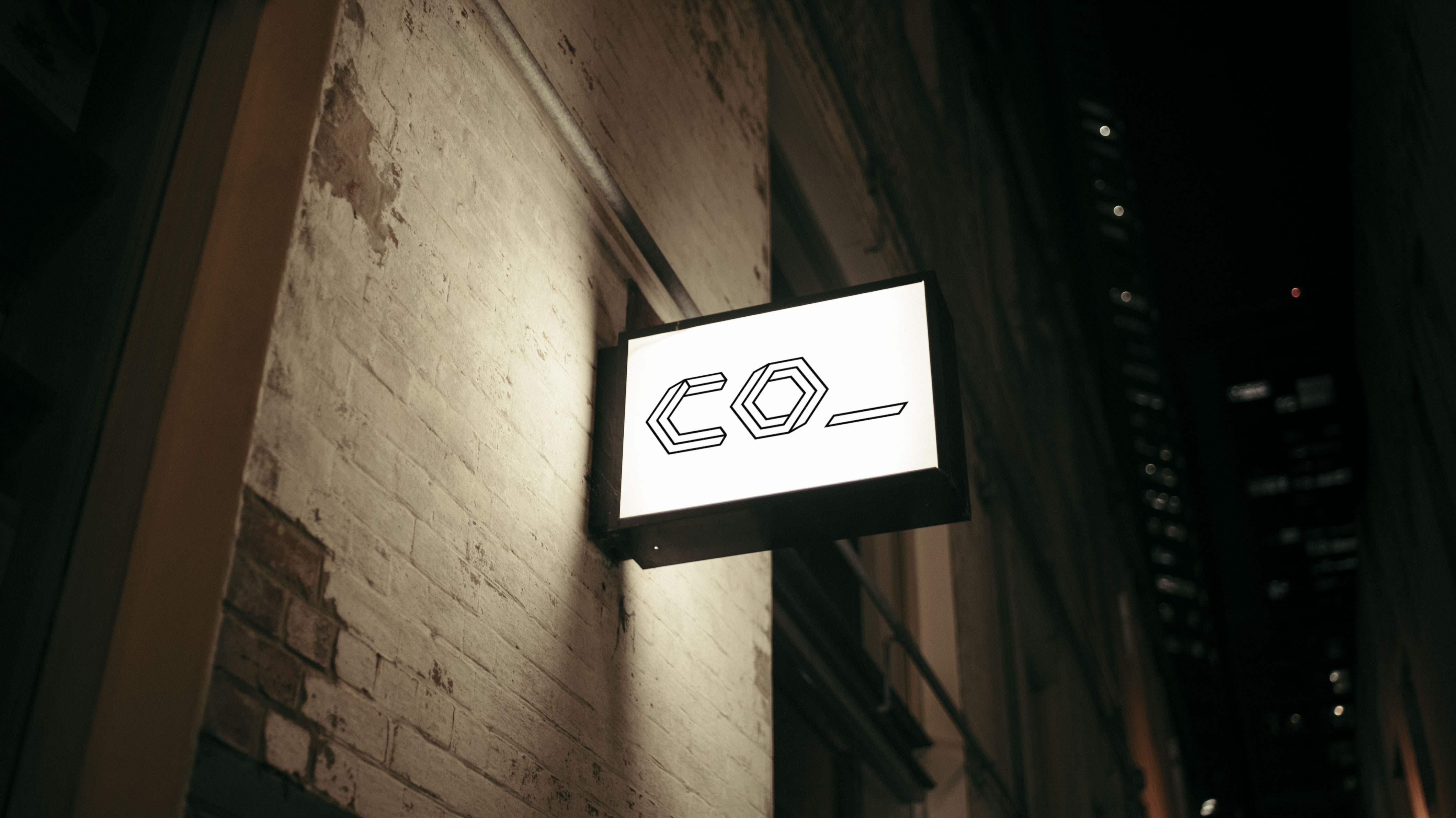
The logo was inspired by brutalist architecture. This stripped-back, functional aesthetic was chosen to allow the artists and designers living and breathing within the walls of the co-work a 'blank canvas' to imagine the space for themselves so that the creative space would be a true reflection of the community within.
The name co_ came from initial brainstorms where many words with a 'co-' prefix came about such as collaboration, community, collection and connection. I felt this would make a powerful and extendible name for this creative cowork. The idea would be that you could have extensions of the brand such as 'co_lab' - a design studio or 'co_play' - a Friday night drinks event etc.